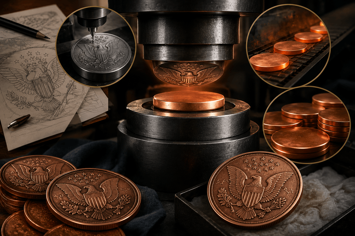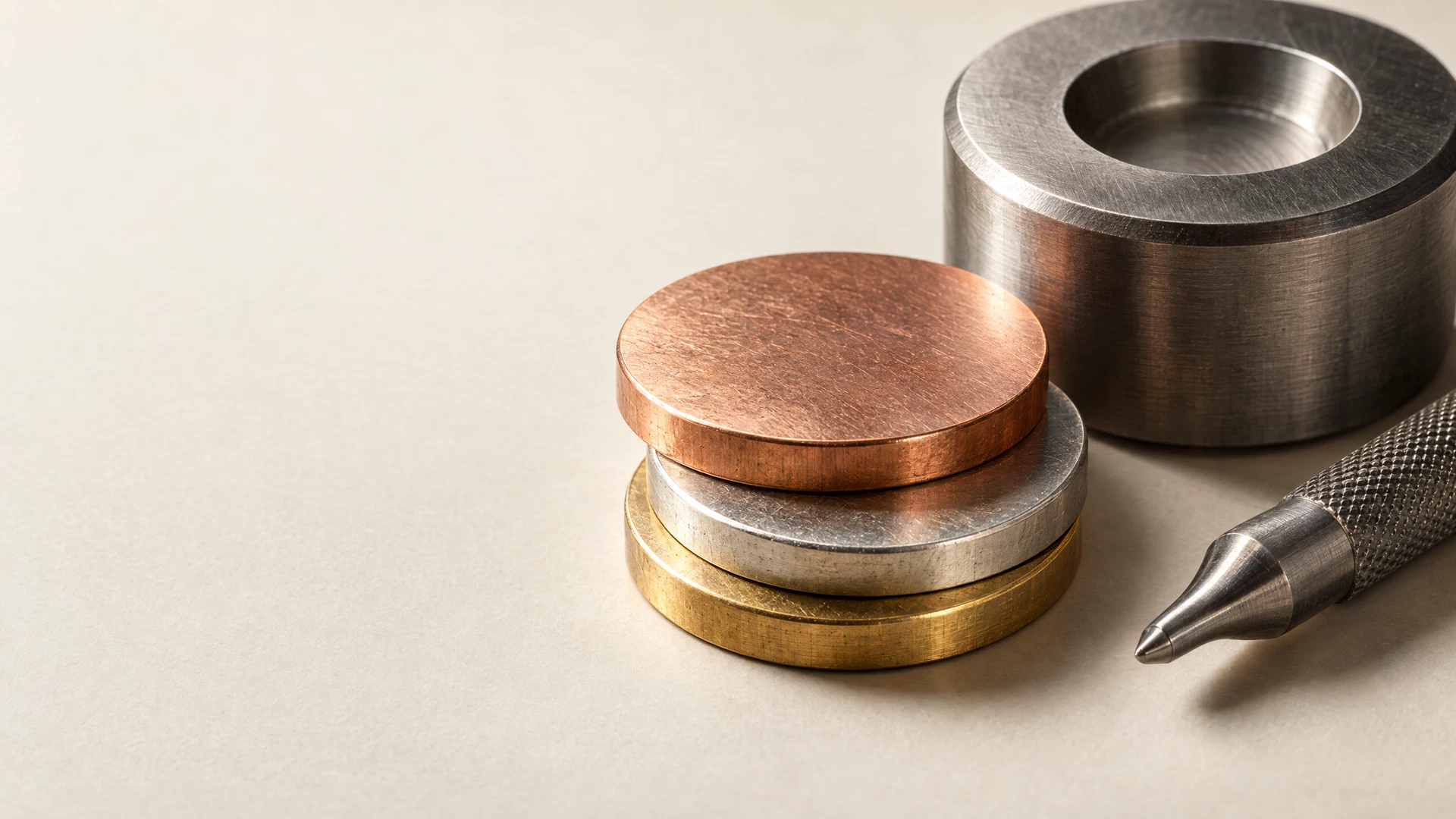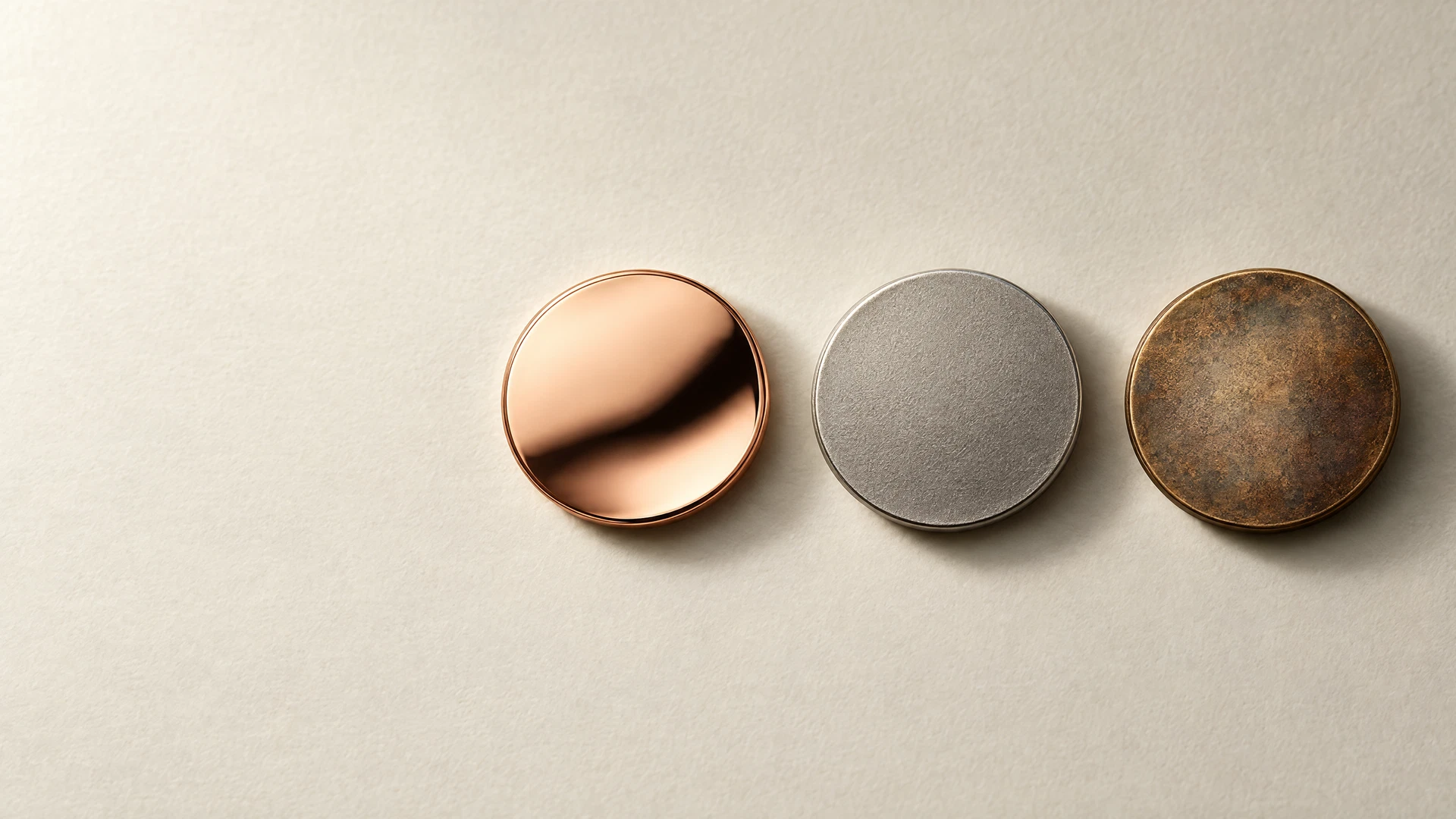
A coin finish is the surface character that determines how a struck design meets light. A proof-like direction emphasizes reflection and crisp contrast; a matte direction softens glare and makes texture feel more deliberate; an antique effect darkens or tones a surface to bring relief forward. None is inherently better. The useful choice is the one that reinforces the artwork, the intended mood, and the details a viewer should notice first.
Use finish as art direction, not as a grade or a promise of collector value. In numismatic language, a proof is a specially made coin, while prooflike describes an appearance with mirrorlike fields; the two terms are related but not interchangeable. The U.S. Mint’s glossary and PCGS explanation of proof versus prooflike make that distinction clear. For a private-mint project, it is safer to describe the visual result you want than to rely on a label alone.
Finish is a design decision, not a quality ranking
A finish changes the visual hierarchy of the same design. A reflective field can make lettering appear sharp in one view and disappear in glare in another; a low-reflective field makes the same lettering calmer and more graphic. Relief, open space, border treatment, and field area still matter.
Name a finish after the direction is clear. Decide what the piece should communicate: clean and ceremonial, spare and contemporary, or aged and narrative. The private minting process and coin basics hub explains the striking and relief vocabulary that makes that conversation more precise.
- Choose the first read: brilliant contrast, soft texture, or aged depth.
- Identify the details that must remain legible at a glance.
- Treat photographs and digital renderings as direction, not a substitute for reviewing the actual design.
Proof-like, matte, and antique at a glance
Proof-like: reflection as a design element
A proof-like look emphasizes mirrorlike fields. PCGS reserves Proof for a specially made coin and uses prooflike to describe mirrorlike fields, so the terms are not interchangeable. In a brief, ‘proof-like’ names a visual direction without implying a grading designation or production protocol. It can suit confident silhouettes and controlled open fields.
Matte: texture over shine
Matte is an intentionally non-reflective finish in the NGC glossary. It can make a field recede and let shape, edge, and relief carry the contrast. Consider it for sculptural modeling, architectural forms, or typography that should not compete with a reflective background.
Antique: depth through tonal contrast
An antique or antiqued effect is surface tone and visual depth, not literal age. NGC defines it as a post-striking chemical treatment that imparts uniform color and texture. In a brief, state where darker tone should sit and which raised areas should remain prominent; ‘antique’ does not specify one shade.
- Proof-like: bright fields, reflected light, and a polished visual statement.
- Matte: subdued reflection, tactile character, and a calm field behind the design.
- Antique: tonal separation that can emphasize modeled detail and an aged visual mood.
Match the finish to the artwork before you specify it
Begin with the design’s high-priority features: a portrait’s face and contour, an emblem’s silhouette and ring of text, or a scene’s foreground-versus-background separation. A finish should support those features rather than add surface drama everywhere at once.
A proof-like direction can give a simple emblem a formal stage, while a detailed scene may need a quieter field or selective contrast. Matte can help a field sit back, but fine detail still depends on the relief and artwork. Antique tonal contrast can clarify illustrated layers, though too much darkness can merge delicate lines. The custom copper coin design guide offers related context on translating an idea into a physical, coin-like piece.
- For small text, ask where reflections could interrupt readability.
- For deep illustration, identify the planes that need the strongest separation.
- For a logo-led piece, decide whether the logo should read as bright, sculptural, or timeworn.
Ask for contrast, not just a finish name
Finish names are useful shorthand, not a complete specification. Two pieces described as proof-like can read differently when one has broad fields and the other a dense frame of lettering. The U.S. Mint’s examples of enhanced finishes show that polishing and frosting can be isolated to particular elements, so contrast can be planned within a design rather than treated as all-or-nothing.
A practical brief names the intended mood, the field-and-device relationship, and the features that need emphasis. Add a sentence to each reference image: note the mirror field, low-glare background, darkened recesses, or rim separation you want to carry forward.
- Describe the field: mirrorlike, low-reflective, toned, or a planned combination.
- Describe the relief: bright against dark, textured against smooth, or even in appearance.
- Describe the viewing experience: formal presentation, everyday handling, display, or a story-led collector piece.
Review the visual direction in the full project brief
Consider finish alongside art, dimensions, relief, edge, and presentation context. A direction that looks ideal in a flat rendering may need refinement when viewed as an object under changing light. Keep the non-negotiables distinct from preferences so the finish supports the concept without being mistaken for a guaranteed outcome.
Use the custom project planning resources to organize the concept, references, intended audience, and questions needing project-specific confirmation. The aim is a coherent surface character, not a stock label imposed on the design.
Frequently asked questions
Is proof-like the same as a Proof coin?
No. Prooflike describes a mirrorlike appearance, especially in the fields. Proof refers to a separately made type of coin. In a brief, use ‘proof-like’ for the appearance you want rather than as a grading claim or a promise of a particular production process.
Will a matte finish make a design easier to read?
It can reduce glare and let shape or relief carry more contrast, but it cannot replace clear art, suitable line weight, and well-planned relief. Review the lettering, open space, and key elements together.
Does an antique finish mean the piece is old or naturally toned?
No. In numismatic terminology, antiqued describes a deliberate post-striking treatment that gives a coin or medal uniform color and texture. Discuss the desired visual effect instead of assuming it from the name.
Can one design use more than one surface character?
It can be part of a design direction. Identify the areas meant to be reflective, subdued, or visually darker, then evaluate the idea against the artwork. What is appropriate depends on the individual project.
A project conversation
Turn the finish idea into a clear visual brief
Once the artwork and visual priorities are defined, a project review can help frame the questions that need project-specific confirmation. Bring reference images and note whether you are aiming for reflected light, quiet texture, tonal depth, or a deliberate contrast between them.
Start a project reviewClosing perspective
The best coin finish is the one that makes the design easier to experience as intended. Proof-like reflection can feel crisp and formal; matte can feel restrained and tactile; antique effects can give relief and narrative detail more depth. Each changes the same artwork in a different way.
Choose the surface character after identifying the features that matter most. When the finish, relief, and artwork point in the same direction, the resulting piece has a clearer visual voice without relying on a label to do all the work.